
Trilogy
The ultimate challenge: branding and driving sales for a destination that doesn’t yet exist.
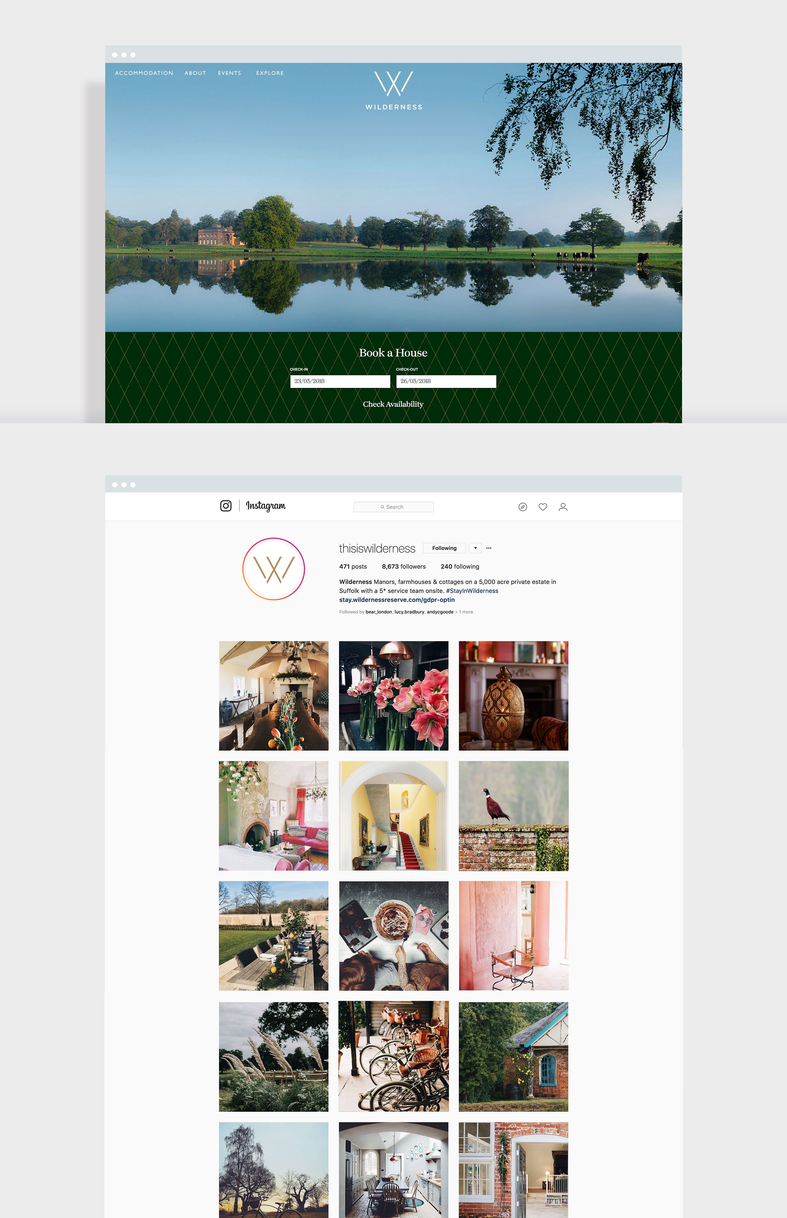
Rebranding a quintessentially English, luxury destination to drive sales
Wilderness Reserve is an extraordinary Suffolk estate, providing luxury escapes with its collection of manors, farmhouses, cottages and parkland. We were tasked with rebranding it – Wilderness had established its business but was looking to take a strategic step-up to compete in the mid-to-high end of the market for short stays, and communicate just how special its offer is.
Memories made.
Our strategy for Wilderness was built on the unique offer it provides: once in a lifetime memories. We built a brand around a carefully designed logo which includes a hidden X within the W. This X alludes to etching in the wild and marking a spot of memorable or emotional significance, reflecting the human connections and memories guests make at Wilderness. The brand colour palette went further to locate this exceptional destination by using rich heritage greens and golds, plus Wilderness's own take on Suffolk Pink - lifted from the cottages themselves.
The brand personality is luxurious but accessible, special but simple.
For us, photography was key in demonstrating the brand personality. With this in mind we introduced lifestyle photography into the brand in order to project not only essence of Wilderness, and the extraordinary experience each property represents, but also the personal memories that guest make in abundance when they stay.


Wilderness embraced all the ways in which their brand can enhance a guest's experience: touchpoints from private transfers in a classic Rolls Royce, to treasure maps to explore the reserve at your leisure.
Get in touch with our sales team to discuss your next project

